I'm still into the panels at the moment. Several months ago I told you about a panel-based quilt I did for a friend. That panel was the Robert Kaufman "Trieste" design, with coordinating fabrics. I called that one
"Persian Carpet in Gold". When I bought that panel, I also bought a few panels of the same design in "jewel tones". Here's one:
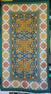 |
| (click the photo above to see a larger image) |
Gorgeous, isn't it?!?
I goofed and didn't purchase the coordinating fabrics - and of course, as such things happen, the coordinating print isn't available any more. I'd have to get compatible fabrics to marry with this panel. That wasn't easy, however, because the blues in the center of the panel turned out to be impossible to match. The edge of the panel has teal and turquoise - which I was able to get... PRETTY close to... And I managed to get my hands on metallic gold and red (also Robert Kaufman) which pulls those colours well out of the panel:
The teal is a great match for the panel's edging. The turquoise not so much, but if I use it sparingly, maybe it will "fool your eye". Now I started playing around with designs. This is the one I almost went with:
I like it a lot - but then liked this one better but....
Once I Photoshop'd the original panel into the design
(as I did above), I knew I was in trouble. My borders were simply to bulky and pushy. They were going to overwelm the center panel - exactly what I didn't want.
Looking at the panel, I was sure that the gold fabric should be the first border band outside of the panel. So I went ahead and added a 3" border with that fabric:
Yes... so far so good. But what comes next? After agonizing over this for several days, I finally came to the conclusion that just solid borders - nothing with a pattern or design - would work best. What I really wanted and needed was just a frame for that center panel - nothing more. So here's the initial design I came up with:
The simple borders work well with the complex center.
This quilt is a commission - so I felt I should stop at this point and discuss the design with my friend Janet, who is buying the quilt.
She looked at the fabrics and felt very strongly that although the teal was OK, the turquoise pushed the overall quilt too far into blue/green terrirtory. So we removed the turquoise and replaced it with the red/metallic gold print.
And here it is all ready to be quilted:


No comments:
Post a Comment